Basic Data Analysis: Panda, Numpy
Plot Data: Matplotlib, Seaborn, Plotly
Optimization of Math: Scipy, Gurobi, CPLEX

Enter Slide 1 Title Here

Enter Slide 2 Title Here

Enter Slide 3 Title Here
Basic Data Analysis: Panda, Numpy
Plot Data: Matplotlib, Seaborn, Plotly
Optimization of Math: Scipy, Gurobi, CPLEX
If you want to show regression effect of two numerical variable with two different categorical or binary variable then you can use this style

import seaborn as sns
import matplotlib.pyplot as plt
import numpy as np
from sklearn.linear_model import LinearRegression
from sklearn.metrics import r2_score
sns.set_theme(style="ticks")
# Assuming df is your DataFrame
# Define the palette for the hue
hue_palette = sns.color_palette("husl", n_colors=df['g_type'].nunique())
# Initialize the relplot
plot = sns.relplot(
data=df,
x="n_veh", y="tit",
hue="g_type", col="n_lane",
kind="line", palette=hue_palette,
height=5, aspect=.75, facet_kws=dict(sharex=False),
)
# Set x-axis limit to ensure the time range is displayed correctly
plot.set(xlim=(2, 13))
# Calculate R^2 values and add annotations
for ax in plot.axes.flat:
n_lane = ax.get_title().split('=')[-1].strip()
subset = df[df['n_lane'] == int(n_lane)]
for g_type in subset['g_type'].unique():
sub_subset = subset[subset['g_type'] == g_type]
X = sub_subset['n_veh'].values.reshape(-1, 1)
y = sub_subset['tit'].values
if len(X) > 1: # LinearRegression requires at least two points
model = LinearRegression().fit(X, y)
y_pred = model.predict(X)
r2 = r2_score(y, y_pred)
ax.text(
0.1, 0.9 - 0.1 * list(subset['g_type'].unique()).index(g_type),
f'{g_type} $R^2$ = {r2:.2f}',
transform=ax.transAxes,
fontsize=9
)
# Set the title for each facet
plt.subplots_adjust(top=0.9)
plt.suptitle("TIT vs Number of Vehicles by Lane", fontsize=16)
plt.show()

import seaborn as sns
import matplotlib.pyplot as plt
import numpy as np
from sklearn.preprocessing import PolynomialFeatures
from sklearn.linear_model import LinearRegression
from sklearn.metrics import r2_score
# Assuming df is your DataFrame
# Calculate average TIT and standard deviation for each n_veh value
average_df = df.groupby(['g_type', 'n_lane', 'n_veh'])['tit'].agg(['mean', 'std']).reset_index()
# Rename the columns
average_df = average_df.rename(columns={'n_lane': 'Lane Number', 'g_type': 'Group Type'})
# Define the palette for the hue
hue_palette = sns.color_palette("husl", n_colors=average_df['Group Type'].nunique())
# Initialize the relplot
plot = sns.relplot(
data=average_df,
x="n_veh", y="mean",
hue="Group Type", col="Lane Number",
kind="line", palette=hue_palette,
height=5, aspect=.75, facet_kws=dict(sharex=False),
)
# Set x-axis and y-axis labels
plot.set_axis_labels("Vehicle Number", "Average TIT")
# Add upper and lower bounds
for ax in plot.axes.flat:
n_lane = ax.get_title().split('=')[-1].strip()
subset = average_df[average_df['Lane Number'] == int(n_lane)]
for g_type in subset['Group Type'].unique():
sub_subset = subset[subset['Group Type'] == g_type]
x = sub_subset['n_veh']
upper_bound = sub_subset['mean'] + sub_subset['std']
lower_bound = sub_subset['mean'] - sub_subset['std']
ax.fill_between(x, lower_bound, upper_bound, alpha=0.1)
# Calculate R^2 values and add annotations
for ax in plot.axes.flat:
n_lane = ax.get_title().split('=')[-1].strip()
subset = average_df[average_df['Lane Number'] == int(n_lane)]
for g_type in subset['Group Type'].unique():
sub_subset = subset[subset['Group Type'] == g_type]
X = sub_subset['n_veh'].values.reshape(-1, 1)
y = sub_subset['mean'].values
if len(X) > 1: # Polynomial regression requires at least two points
poly = PolynomialFeatures(degree=2) # You can adjust the degree as needed
X_poly = poly.fit_transform(X)
model = LinearRegression().fit(X_poly, y)
y_pred = model.predict(X_poly)
r2 = r2_score(y, y_pred)
ax.text(
0.1, 0.9 - 0.1 * list(subset['Group Type'].unique()).index(g_type),
f'{g_type} $R^2$ = {r2:.2f}',
transform=ax.transAxes,
fontsize=9
)
# Set the title for each facet
plt.subplots_adjust(top=0.9)
plt.suptitle("", fontsize=16)
plt.show()
You can show your dependent variable effect with other two categorical or binary variables suign this method.
Step 1: make a pivot table
import pandas as pd
# Assuming df is your existing DataFrame
# Create the pivot table
pivot_table = df.pivot_table(values='tit', index='g_type', columns='n_lane', aggfunc='count', fill_value=0)
# Display the pivot table
print(pivot_table)
Step 2: find the significant t-value
from scipy.stats import ttest_ind
# Filter the DataFrame for each group and lane
hetero_lane_2_data = df[(df['g_type'] == 'hetero') & (df['n_lane'] == 2)]['tit']
hetero_lane_3_data = df[(df['g_type'] == 'hetero') & (df['n_lane'] == 3)]['tit']
homo_lane_2_data = df[(df['g_type'] == 'homo') & (df['n_lane'] == 2)]['tit']
homo_lane_3_data = df[(df['g_type'] == 'homo') & (df['n_lane'] == 3)]['tit']
# Perform t-tests
t_stat_hetero, p_value_hetero = ttest_ind(hetero_lane_2_data, hetero_lane_3_data, nan_policy='omit')
t_stat_homo, p_value_homo = ttest_ind(homo_lane_2_data, homo_lane_3_data, nan_policy='omit')
print(f"P-value for Hetero group between Lane 2 and Lane 3: {p_value_hetero}")
print(f"P-value for Homo group between Lane 2 and Lane 3: {p_value_homo}")

Step 3: plot the significant bar with box
import seaborn as sns
import matplotlib.pyplot as plt
from scipy.stats import ttest_ind
# Set Seaborn theme
sns.set_theme(style="whitegrid")
# Create the box plot
plt.figure(figsize=(10, 6))
boxplot = sns.boxplot(data=df, x='g_type', y='tit', hue='n_lane', palette='Set3')
# Set labels and title
plt.xlabel('Group Type', fontsize=12) # Change x-axis label
plt.ylabel('TIT', fontsize=12) # Change y-axis label
plt.title('', fontsize=14) # Change plot title
# Perform t-tests
hetero_lane_2_data = df[(df['g_type'] == 'hetero') & (df['n_lane'] == 2)]['tit']
hetero_lane_3_data = df[(df['g_type'] == 'hetero') & (df['n_lane'] == 3)]['tit']
homo_lane_2_data = df[(df['g_type'] == 'homo') & (df['n_lane'] == 2)]['tit']
homo_lane_3_data = df[(df['g_type'] == 'homo') & (df['n_lane'] == 3)]['tit']
t_stat_hetero, p_value_hetero = ttest_ind(hetero_lane_2_data, hetero_lane_3_data, nan_policy='omit')
t_stat_homo, p_value_homo = ttest_ind(homo_lane_2_data, homo_lane_3_data, nan_policy='omit')
# Function to add significance bars with symbols
def add_significance_bar(ax, x1, x2, y, p_value, bar_color='k', sig_marker='***', y_offset=0.1):
level = 1 # Set the significance bar level
bar_height_top = y + 0.1 * level
bar_height_bottom = y - 0.1 * level
# Adjust x-positions for center placement relative to the boxplot
x_center = (x1 + x2) / 2
# Add bars above and below the box plot
ax.plot([x1, x1, x2, x2], [bar_height_top, y, y, bar_height_bottom], lw=1, c=bar_color)
# Annotate with significance level text
if p_value < 0.001:
sig_symbol = '***'
elif p_value < 0.01:
sig_symbol = '**'
elif p_value < 0.05:
sig_symbol = '*'
else:
sig_symbol = ''
# Adjust vertical alignment based on y_offset
if y_offset > 0:
va = 'bottom'
else:
va = 'top'
ax.text(x_center, y + 0.01 * y_offset, sig_symbol, ha='center', va='bottom', c='red') # Significance level text
# Specify x-positions for significance bars (placeholders, adjusted in function)
x1_hetero = 0.2
x2_hetero = 1.2
x1_homo = -0.2
x2_homo = 0.8
# Add significance bars and annotate with p-values
add_significance_bar(plt.gca(), x1_hetero, x2_hetero, 50, p_value_hetero, bar_color='blue', sig_marker='***', y_offset=0.2) # Adjust the y position here
add_significance_bar(plt.gca(), x1_homo, x2_homo, 45, p_value_homo, bar_color='blue', sig_marker='***', y_offset=0.2) # Adjust the y position here
# Change legend title
plt.legend(title='Lane Number', loc='upper right')
# Show plot
plt.show()
In order to feed the proposed network with a certain data dimension and improve the accuracy of the model, the raw data collected by motion sensors need to be pre-processed as follows.
1. Linear Interpolation:
The datasets mentioned above are realistic and the sensors worn on the subjects are wireless. Therefore, some data may be lost during the collection process, and the lost data is usually indicated with NaN/0. To overcome this problem, the linear interpolation algorithm was used to fill the missing values in this paper.
2. Scaling and Normalization:
Using large values from channels directly to train models may lead to training bais, So it is necessary to normalize the input data to the range of 0 to 1, as shown in figure.


To divided data based in the spatilal and temporal requirement. for furthe analysis.

Here the useful libraries:

Querying, filtering, sampling:


pip install researchpy
import pandas as pd
import researchpy as rp
df = pd.read_csv("https://raw.githubusercontent.com/researchpy/Data-sets/master/blood_pressure.csv")
df.info()
df['bp_before'].describe()
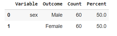
df['sex'].describe()
df['sex'].value_counts()
df['bp_before'].kurtosis()
df['bp_before'].skew()
rp.summary_cont(df['bp_before'])
rp.summary_cat(df['sex'])


